
If I had a dollar for every time a stakeholder asked me to "make it pop," I wouldn't need to be a designer anymore; I’d be retired on a beach somewhere, sitting with a drink in my hand and detoxing all the feedback loops and wasted screentime.
We’ve all been there. A stakeholder… usually a marketer hands over a Word doc full of brilliant strategy and says, "Do your magic." Then, when the first draft comes back, the feedback loop descends into a downward spiral of "I’ll know it when I see it." It’s frustrating, it’s expensive. And this goes on and on until the deadline is banging on the door, and posting subpar content eventually becomes the norm. Honestly, this is always a missed oppurtunity for the brand, and trust me, no designer wants to work on brand graphics thats boring, bland and similar to every other social media post that appears on google images.
From our side of the screen, we don't want you to master the adobe suite, figma or even canva (shoutout to affinity too). What we really want is for you to speak the same language so we can stop guessing what you mean and start building things that actually convert.
The Designer-Marketer Friction Point
The gap between a creative brief and a finished asset isn’t just a "creative difference;" it’s a translation error. Let me clarify.
When we hear vague phrases like "Can we make it more modern?" or "It needs more energy," we have to guess. Do you mean bold colors? Minimalist layout? Edgy typography? Each guess adds hours to the timeline and layers of "revision fatigue" to the relationship.
The real tragedy isn't the extra work, though. It’s the diluted strategy. Just to meet the deadline, a marketer might unwillingly approve a layout where:
The primary button is drowning in a sea of secondary icons.
The "approachable" brand voice is being shouted over by aggressive, jagged fonts.
The high-value offer is hidden because there’s no visual "breathing room."
The core of the problem is always design literacy.
Speak the Language (Without opening design tools)
You don’t need to be an artist to be a great design collaborator. You just need to understand the logic behind the aesthetics. When you can point to a specific principle, the conversation shifts from "subjective taste" to "objective performance."
The "Look Here First" Rule a.k.a Hierarchy
Hierarchy is how we guide a user’s eyes. If every element on the page is screaming at the same volume, your audience hears nothing but noise. Let elements guide the viewer’s eye to what really matters (probably the contact number)
Designer Tip: If you feel a design is "cluttered," don't ask to move things around randomly. Ask: "What is the one thing the user should see first?" We’ll use size, weight, and position to make that happen.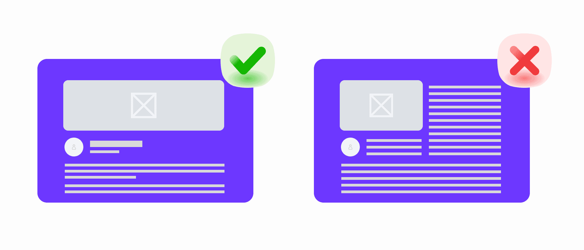
The "Call to Action" Engine a.k.a Contrast
Contrast isn't just about pretty colors; it's about utility. It’s what makes a button look like a button. If your "Buy Now" link is a thin grey font on a white background, you aren't being "minimalist", you're being invisible.
Designer Tip:
High Contrast = Importance. Use it for your most vital information.
Low Contrast = Context. Use it for the "fine print" or secondary details.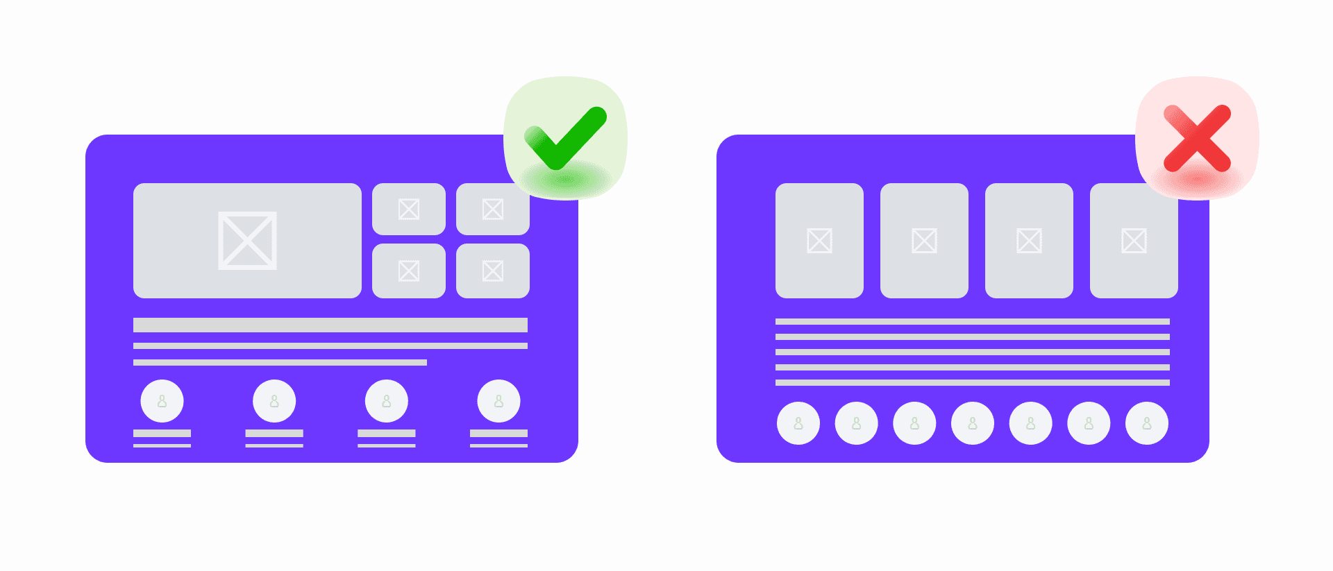
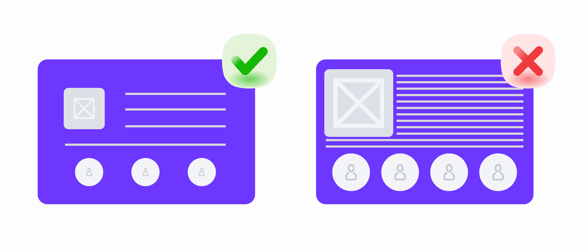
The "Premium" Factor a.k.a Whitespace
Inexperienced marketers often see empty space as "wasted real estate" and want to fill it with another logo or a testimonial. Designers see it as sanity. Whitespace allows the brain to process information without feeling overwhelmed. It makes a brand feel confident and high-end. If you want people to actually read your copy, let it breathe.
Designer Tip: Tell your designer to use more whitespace than necessary. While reviewing, ask them to reduce to the optimal amount. Sit with them to give your input too. That way you learn what makes the design “premium” too.
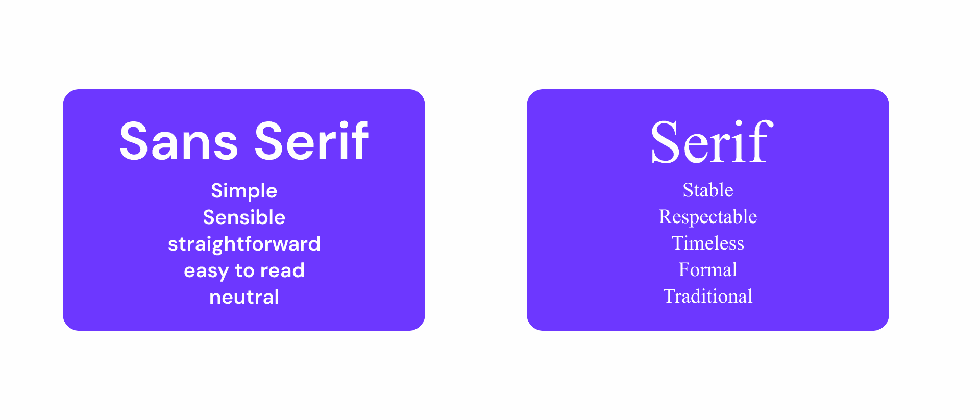
The Visual Tone of Voice a.k.a. Typography
Fonts carry emotional baggage. Fonts talk.
A serif font (like Times New Roman) feels traditional and authoritative. A rounded sans-serif feels friendly and tech-forward. When you give feedback, think about the mood. If the font "feels off," tell us the emotion it’s triggering versus the emotion you want. We can fix the rest.
Designer Tip: Guide the designer to the mood you want. Dont tell them the exact font to use. Because, your designer most likely has the huge library of unused fonts that they want to use. Alternatively, they might also hate Poppins, or Arial, or if they’re like me … Inter.
The Bottom Line
When a marketer understands these principles, the "Designer-Marketer Divide" disappears. We stop being "pixel-pushers" and start being strategic partners. Instead of saying, "I don't like this," try saying, "I think the hierarchy is favoring the image over the headline." That one sentence saves us three rounds of revisions and makes the final campaign ten times stronger. Psst.. also saves a lot of budget.
So, the next time you're looking at a layout, don't just react with your gut. Analyze it. The more you understand why design works, the better your results will look. Spend time on Pinterest, Cosmos or Instagram.
You need to see good design to understand good design.
In an era where AI can do half your work, the human factor is always the crucial difference. With design knowledge you can guide your preferred model to make better designs too. Consider this as a utility tool in your belt. It helps you make better presentations, convince your stakeholders and also help you make a decision when the designers is not picking up the phone.